Showing posts with label Heidi Swapp. Show all posts

Friday, June 3, 2016

Adding Foiled Words to a Layout

Adding foiled words to a layout is a great way to add an extra pop of color and fun to a layout. Today I have a 2 page layout that uses custom foiled words on both sides of the layout.


I want to start by saying that I just don't think you can have too much of a good thing, and I love both Heidi Swapp's Minc foil (and all the fabulous embellishments she has for foiling) and Therm O Web's Deco Foil. I have lots of both, and they both work great.


I used words from Heidi Swapp's Die Cut Jumbo Words, and a 3 x 3 "fabulous" card from Heidi Swapp's Minc 3 x 3 Card Set.


It's a little tough to tell from this photo, but the "fabulous" card is covered in green Minc Foil, while "hello sunshine" is covered in pumpkin Therm O Web Foil. I chose orange and green foils to pick up the color from the Elle's Studio patterned paper I used for the layout.


Since the right hand page of my layout is a bit plain, so the foiled "love" adds a lot pizazz to a page that might otherwise be a bit dull.


 Adding foiled words to a layout is a really simple way to add some customized color. Have you tired out either the Heidi Swapp Minc foil of the Therm O Web Deco foil yet? It's really a lot of fun!

Monday, May 16, 2016

Mixing Pocket Pages in with Standard Pages

I don't do a lot of pocket style scrapbooking. However, when I scrap travel photos I like mixing in pocket pages with standard pages. Sometimes I have a lot of scenery photos that are similar, or from the same place, so I don't have journaling for every page, but I still want to print and scrap all of the photos. Here's an example of how I mix pocket pages in with standard pages.


As you can see, the page on the left is very simple. I filled the whole page with 4x6 photos, and just added a few stickers to accent the photos.


I focused more on the right hand side of the spread. I used American Crafts True Stories to scrap my larger 5x7 photo of Ireland's Giant's Causeway. 


 I foiled some Heidi Swapp Minc cards with blue foil to add a little extra pop to the page. I love using foil to add a little extra something to my page and love that you can use the Minc to customize your foil color to whatever works with your layout.


Do you do much pocket style scrapbooking? How do you utilize pocket pages?

Thursday, February 11, 2016

Black, White, and Silver Layout

This is a personal blog. All editorial content and projects are intellectual property of Taylor Stamped. I do receive financial compensation and material product from American Crafts and  A Walk Down Memory Lane to develop my craft posts, but all ideas and opinions are my own. Some links are affiliate links.

 I love using lots of color on my layouts, but once in a while it's fun to play around with the absence of color on a layout. Today, I have a black, white, and silver layout.


I started with a Bella Blvd Clear Cut. I loved the black arrows and adventure words for my travel layout. Since the paper is clear, I backed it with a piece of simple white card stock.


To bring in some interest, I matted each of my photos with shiny silver card stock. I carried more of the silver throughout the layout with the help of some silver Therm O Web Deco Foil and some Heidi Swapp Minc Insta Cards.


 Finally I added a few more touches of black, white, and silver with some We R Memory Keepers Clearly Posh Ephemera and We R Enamel Dots and Shapes.


 This black, white, and sliver layout is a nice break from my normal bright colors. It has a fun, modern and sophisticated feel, and successfully tells the story I wanted to tell! 

Friday, January 15, 2016

Travel Pocket Layout

This is a personal blog. All editorial content and projects are intellectual property of Taylor Stamped. I do receive financial compensation and material product from American Crafts and  A Walk Down Memory Lane to develop my craft posts, but all ideas and opinions are my own. Some links are affiliate links.

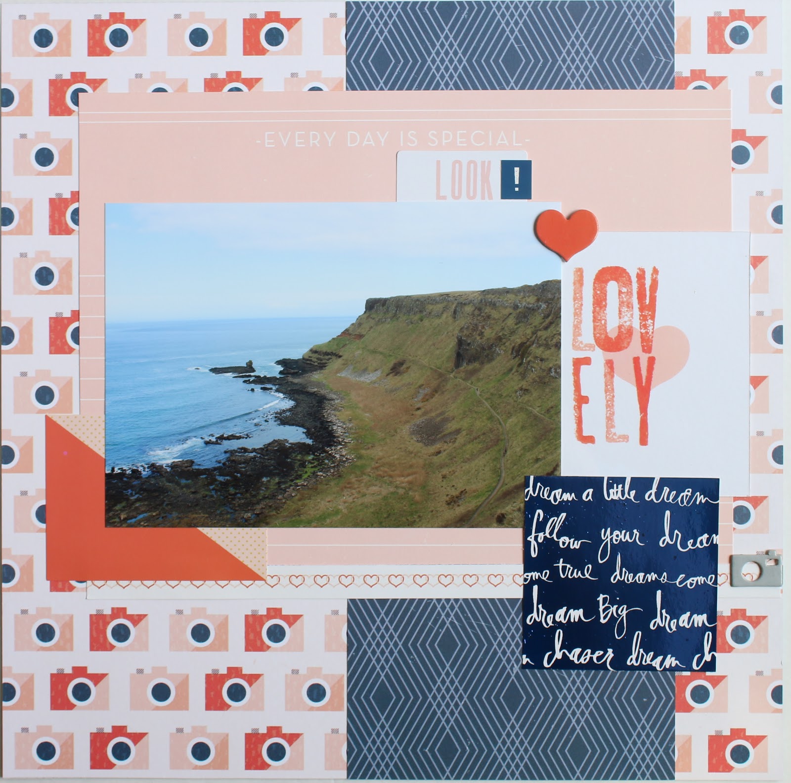
I don't do a lot of pocket style scrapping, it often just doesn't come naturally to me. I have found, though that there are times pocket pages really help break up the look of an album, especially when you have lots and lots of photos of the same thing. For example, I'm still plugging along scrapping photos from our trip to Ireland. For some of these photos, I have a about 1 spot worth of journaling to 10 or 20 photos. Breaking up the photos upon photos with a travel pocket layout really helps give your eye something different to look at and helps get those piles and piles of photos into an album.


I like to mix my pocket pages in with "regular" pages in my album. You can really see the difference between the 2 style of pages here, even though the layout of the pages is similar. The page on the left is a standard page, whereas the page on the right is a pocket page.


To keep the pages feeling a bit congruent, I used the same paper collection (Pink Paislee Atlas) on both pages, the same font for creating words, and pops of the same silver and teal foil on both pages.


I created my foiled titles by cutting custom words out with my Silhouette Cameo from Heidi Swapp Minc Toner Sheets. Then I covered the words with either silver or teal foil.


Then I added more pops of foil with Minc stickers, journaling cards, and patterned paper.


For me, using pocket pages for this travel pocket layout was a bit outside of my comfort zone, but in the end it really pays off. Using a pocket page really breaks up the look in my album, and gives your eye something new and different to look at. 

So, how about you? Do you love using pocket pages, or are they a bit outside of your comfort zone, too? I'd love to hear about how you break up pages and pages of travel photos!

Tuesday, October 6, 2015

Pumpkin Layout

This is a personal blog. All editorial content and projects are intellectual property of Taylor Stamped. I do receive financial compensation and material product from American Crafts and  A Walk Down Memory Lane to develop my craft posts, but all ideas and opinions are my own. Some links are affiliate links.

My kids love picking out their pumpkins, and I love seeing what they carve from them. Their personalities always seem to shine through in their design. Today I've got a pumpkin layout using  Photo Play Paper Autumn Day documenting their jack-o-lanterns from last year. 


Sometimes when I'm working with patterned papers that are a bit busy (like that awesome pumpkin paper), I like to design on an angle, or find a way to split up the paper. You still get to use a lot of the fun patterned paper, but the area where a busy paper comes together with a not so busy paper creates a natural focal point that draws your eye. Place a photo(s) in that same area, and your photo still takes center stage.


 I've mentioned that I love using metallics on fall layouts, especially layouts using Photo Play's Autumn Day, and this layout is no exception. Here I used a Heidi Swapp Minc tag and covered it with some some mint Minc foil.


 Such a fun time of year to scrap. I hope you're enjoying fall so far and taking lots fun autumn photos.
Thanks for stopping by!

Tuesday, September 8, 2015

Pocket Pages

This is a personal blog. All editorial content and projects are intellectual property of Taylor Stamped. I do receive financial compensation and material product from American Crafts and A Walk Down Memory Lane to develop my craft posts, but all ideas and opinions are my own. Some links are affiliate links.

I don't do a lot of pocket pages. I love the look of them, but I'm just not very good at planning the front and back sides. I have so many photos from Ireland, though (especially ones of the beautiful countryside) that creating some pocket pages is a perfect way to get them scrapped.

 Here is the front side of my pocket page.


One of the best things about pocket pages is that you have built in memorabilia pockets. I wanted to save our map of Galway, and I could do so easily and quickly.  I used cards and embellishments from Simple Stories Gold Snap Pack to fill in the pockets that didn't have photos. I used an "Enjoy the View" word set from the Heidi Swapp Minc Diecut Words. I covered the words in Therm O Web Turquoise Satin Foil. I had to cut the words in half to get them to fit into 2 separate pockets.

Here is the back side of that same pocket page.


The left side uses a pocket page, and the right side mimics the pocket page, without the use of a segmented page. I wanted the layout to look cohesive, but the pocket page wasn't going to work for the next layout in my book.


These layouts aren't fancy, but they're a great way to get my trip memories into a book and keep the memorabilia accessible.


 Thanks for stopping by!

Monday, June 29, 2015

Selfie Mini Album

I wanted to make a quick mini album of all the photos that my husband and I are in together from our trip to Ireland. After all, the whole reason for the trip was to celebrate 10 years of being together. Today I have that selfie mini album.


I thought it would be fun to use the Tim Holtz Idea-ology Flip Frame to bind/display my album. What makes this frame so fun, is that I can put a page on display for a little while, and then after a few days flip to the next page to enjoy that one for a little while.


I kept the pages simple by using larger photos and embellishing over the photos. I also chose one 6x6 paper pad, and used that for the whole album. I grabbed DoCrafts True Blue paper pad since the colors were fairly neutral. 


For embellishments, I used a lot of Heidi Swapp's Minc Stickers covered in Therm O Web Deco Foil and Simple Stories DIY Insta Stickers.


Per my usual problem with mini albums, this album is not so mini. I think there are something like 20 pages to it, but the frame is definitely large enough to hold them all.


It might be a little while until I get all of my photos from our Ireland trip scrapped, but at least I have this to enjoy for now. 


Thanks for stopping by!

Tuesday, June 16, 2015

Explore

I'm fitting in a little blogging and scrapping between swimming lessons and baseball and all that summer fun time! Today, I have another Ireland layout. I'm mixing and matching a bit of paper with this one, playing around with some chipboard frames, journaling on vellum, and using my favorite new stuff: Therm O Web's Deco Foil. Here's Explore:


This is one of those layouts that's so much better in person. It has lots of texture and depth due to the chipboard frames, vellum, and foiled embellishments.


The patterned papers that I used for this layout are from Crate Paper's Notes & Things collection. The soft colors in this collection help set the mood for this layout. Since I used so many textures on this layout, the soft colors also help keep the layout from feeling busy.


I've been using a lot of stickers from American Crafts Shimelle Sticker Book for my Ireland layouts, and this layout was no exception. 


I used some gold Therm O Web foil over the word Explore from the Heidi Swapp Minc Jumbo Words Die Cuts for my title.


I love chipboard frames, but rarely use them to actually frame photos. For this page I used some Simple Stories I Am chipboard frames to frame some gold patterned vellum


Finally, I had to add some journaling, so I printed it out on vellum to keep with the soft vibe of the Explore layout. 

Thanks so much for stopping by!

Monday, June 8, 2015

Father's Day Cards

I can't believe it's June already, but that means it's time to start thinking about Father's Day. I've got my gifts, so now it's time for some Father's Day cards.


I wish you could see these in person. Therm O Web's Deco Foil is so pretty, and it just doesn't come across right in photos. For these cards I used the ocean blue foil. It's really striking in person, and looks great on those big, bold stripes.


I chose Avery Elle's The Man stamp set for both cards. It has lots of fun options for Father's Day cards for both outside and inside the card.


I used blue foil on both cards, but decided to mix up the accent colors. I went with red for the card on the left and orange for the card on the right. It's a little different than my standard blue and green combo for man cards.


I kept my embellishments pretty clean and simple so the foiled paper could really shine (pun totally intended!).


Have you made you Father's Day cards yet? I'd love to see them.
Thanks for stopping by!


Tuesday, May 26, 2015

Mix and Match Layout

Hello! Today I'm sharing a mix and match layout from our Ireland trip. Today's subject is the English Market in Cork. I often stick with the same paper collection when working on layouts, but sometimes that just doesn't work. This English Market layout was one of those times, so I just had to mix and match my papers for myself.


I fell in love with the feel of that blue striped paper for these photos. It's from Bo Bunny Sweet Life collection. I also thought the light blue piece of paper from Sweet Life would work (the one framing the 3 photos and journaling card in the center). The rest of the paper in the collection, while gorgeous, just wasn't right for the feel I was going for with the layout.


So...I went searching the paper racks at A Walk Down Memory Lane for some paper to use with my original picks, and I landed on Bo Bunny Modern Miss. I not only found that fun triangle paper, but also the paper I used to journal on.


I dug into my stash at home for embellishments. I used some enamel dots, Pink Paislee Solstice Ephemera, and Heidi Swapp Mink Jumbo Words (enjoy) covered in Therm O Web Rose Gold Deco Foil. I really, really love that Deco Foil from Therm O Web.


Mixing and matching my papers collections and embellishemts ended up working out pretty well for this layout!
Thanks for stopping by!

Thursday, December 11, 2014

You at 6

I have another layout to share - You at 6 - from when I did my kiddos annual photos this fall.  They grow so fast, and I love capturing who they are at this moment in time. 


It's like Heidi Swapp September Skies was made for my kid's annual photos this year.  When that paper came in, I couldn't believe how well it went with my photos.  Sometimes there's just paper crafting kismet! 


This kid is amazing.  He is goofy and kind, encouraging and energetic.  He loves to play any and every sport, and he still loves to cuddle.  Sometimes he says things that make me wonder what it looks like inside his brain.  This might just be my favorite age yet for him...but I think I say that every year about my kids, because it's just so fun seeing what kind of people they're becoming. 


Thanks for stopping  by, I hope you're having a wonderful week.

Saturday, November 29, 2014

You At 8

I've gotten a bit behind on posting my layouts.  Last month I took my kiddos' annual photos.  I loved how their individual photos turned out.  So many fun ones to chose from that seemed to capture their personalities just right. Today I'm sharing a layout called "You at 8" about my oldest.


First of all, I'm not sure when he grew up this much.  Seriously, he's always been a bit of an old soul, but now he doesn't even look like a little kid anymore. 


I used lots of different paper collections on this layout.  I started with Heidi Swapp's September Skies for the base of the layout.  I don't know why, but I just think that light bulb paper is so stinkin' cute!


I love a good paper printed with words, so I also added paper from Pink Paislee's Bella Rouge Collection (it's currently in the AWDML Brick & Mortar store, and should be showing up in the on-line store any day).  The white and blue heart paper is from Studio Calico's Lemon Lush.  I've wanted to use that heart paper forever and finally had the right layout to use it on. 

My embellishments for this layout consisted of a Project Life journaling card, Thickers chipboard alphas, Pebbles washi tape, enamel dots, and some Studio Calico chip shapes.  So, as you can see this layout is a little bit of this, and a little bit of that, all put together to scrap my oldest at 8.

Thanks for stopping by.