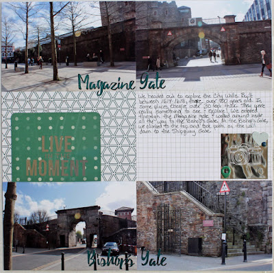
I don't do a lot of pocket style scrapping, it often just doesn't come naturally to me. I have found, though that there are times pocket pages really help break up the look of an album, especially when you have lots and lots of photos of the same thing. For example, I'm still plugging along scrapping photos from our trip to Ireland. For some of these photos, I have a about 1 spot worth of journaling to 10 or 20 photos. Breaking up the photos upon photos with a travel pocket layout really helps give your eye something different to look at and helps get those piles and piles of photos into an album.
I like to mix my pocket pages in with "regular" pages in my album. You can really see the difference between the 2 style of pages here, even though the layout of the pages is similar. The page on the left is a standard page, whereas the page on the right is a pocket page.
To keep the pages feeling a bit congruent, I used the same paper collection (Pink Paislee Atlas) on both pages, the same font for creating words, and pops of the same silver and teal foil on both pages.
I created my foiled titles by cutting custom words out with my Silhouette Cameo from Heidi Swapp Minc Toner Sheets. Then I covered the words with either silver or teal foil.
Then I added more pops of foil with Minc stickers, journaling cards, and patterned paper.
For me, using pocket pages for this travel pocket layout was a bit outside of my comfort zone, but in the end it really pays off. Using a pocket page really breaks up the look in my album, and gives your eye something new and different to look at.


No comments:
Post a Comment