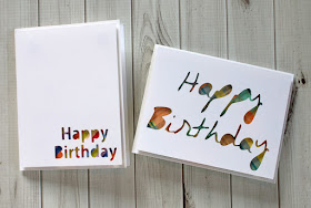
Today I have some very simple birthday cards to share. These are my go to style for when I want a clean and simple card.
I use my silhouette to cut the top panel. I size a rectangle to 4" x 5 1/4". Then, I use any font on my computer to create the happy birthday cut inside the rectangle. Then, I cut it out. You can get 4 card fronts from one 8 1/2" x 11" piece of card stock.
These cards happen to be for my nephews, who are teen boys, so I stuck with fairly simple colors and patterns for my patterned paper. The beauty of these cards is that you can use up scraps from your stash for the patterned paper part.
I like to attach my patterned paper flat to the card base. Then I use dimensional adhesive (my favorite is Pop Up Glue Dots®), to attach the card front to the card. The popped up top layer adds some extra pizazz to the card. These cards sit flat enough to be mailed without any extra postage.
I wrote this post while participating on the Glue Dots® Design Team.
▼
Thursday, April 30, 2020
Wednesday, April 22, 2020
Large Photo Layout
Once in a while there's just no way to get a story told without scrapping a large photo. That's what I have for today, a large photo layout.
This one's a little bit different than some of the other large photo layouts I've shared. Instead of one large photo, I printed a bunch of photos as one large photo collage. I had a lot of photos from our afternoon at Neuschwanstein castle. I'd told much of the story in previous layouts, so why not let some of the gorgeous pictures take center stage.
It snowed this day in the Bavarian Alps, so I wanted to use paper that reflected a bit of that (again, I had told the snow story on a previous layout, so I'm just going for an overall feel). I grabbed what was leftover from the Scrapbooking Store's January Kit which featured Simple Stories Winter Farmhouse collection. It's exactly what its name sounds like; a little bit of winter and a lot of cozy, woodsy vibes.
Because the photo is so large, I focused on framing it with a bit of pretty patterned paper. Then I added a few embellishments around the edges of the photo and even right on top of the photo. Keeping the embellishments simple keeps the layout from feeling too busy.
Do you like scrapping large photos?
I wrote this post while participating on the Scrapbooking Store Design Team.
This one's a little bit different than some of the other large photo layouts I've shared. Instead of one large photo, I printed a bunch of photos as one large photo collage. I had a lot of photos from our afternoon at Neuschwanstein castle. I'd told much of the story in previous layouts, so why not let some of the gorgeous pictures take center stage.
It snowed this day in the Bavarian Alps, so I wanted to use paper that reflected a bit of that (again, I had told the snow story on a previous layout, so I'm just going for an overall feel). I grabbed what was leftover from the Scrapbooking Store's January Kit which featured Simple Stories Winter Farmhouse collection. It's exactly what its name sounds like; a little bit of winter and a lot of cozy, woodsy vibes.
Do you like scrapping large photos?
I wrote this post while participating on the Scrapbooking Store Design Team.
Tuesday, April 7, 2020
On the Road Layout
We spend a lot of time on the read whenever we travel. Whether we're driving to get to our destination or spending a lot of time driving from city to city once we're in a new country, we love finding fun things to do along the way. Today I have an On the Road layout that's all about driving from place to place when on a trip.
For this layout I used Pinkfresh Studio Out and About collection. The map print that I used as the base of this layout seemed perfect for a layout about being on the road from here to there.
Germany had some really nice, clean rest stops (with excellent coffee). The toilets at the rest stops are pay toilets, but they are so clean. I also like to snap a photo of our rental car whenever we get one. It's fun to look back and remember what we drove around in on our trip.
I hope you enjoy the journey, and get some time to scrap it, too!


