Wow! I realized, again, how behind I am on sharing a few creations, so today I have 3 layouts to share. They all use Elementary by Simple Stories.
This one is a pretty straightforward last day of school layout. What I really liked about the Simple Stories papers was the sheet of grade journaling cards. As you can see, all I had to do was cut out the preschool card and fill in some information.
The colors in Elementary also just happened to be perfect for scrapping my son with his brand new Spiderman bike. He was so excited to get this bike, but still wanted to wait all day until Dad came home from work to ride it for the first time. I just happened to have some chipboard pieces from Cosmo Cricket's Boyfriend that went really well with this page.
One more bike page done with Elementary. I love when photos like this just happen. Since I had my camera out with me this day, I was able to capture this special moment between brothers. These 2 make quite the pair, and I love that these photos seem to show that unspoken bond.
Thanks for stopping by!
▼
Wednesday, August 31, 2011
Thursday, August 25, 2011
Keeping Up
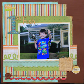
Alright, I'm doing a pretty good job keeping up with crafty stuff. My "to craft" list may not be shrinking, but it's not growing either. However, I'm not doing a good job keeping up with getting the stuff on here. Here's a layout I finished over a week ago. It's my oldest with his first fish.
I've already professed my love of Simple Stories. This layout was created with their birthday line (Happy Day). I just picked the papers that had patterns without a birthday theme. I threw in some stickers from Jillibean Soup Dutch Mustard Soup. I did a lot of inking of edges and roughing them up. It just seemed to go with the outdoor theme. I've got my fingers crossed that I'll get around to posting another project tomorrow.
Thanks for stopping by!
Tuesday, August 23, 2011
Fabulous Felt
Moxie Fab World is having a Fabulous Felt challenge. I ended up with 2 cards for this challenge. When the felt challenge was announced, I immediately thought of making a mustache card with a felt mustache. The card came together quite easily, the hardest part was finding the right greeting. I've seen "I mustache you a question" and "I hate to leave, but I mustache", so I was trying to come up with something else. I finally landed on "mustache-ulations".
This second card came about when I was pricing some new arrivals at A Walk Down Memory Lane this past Saturday, and came across the coolest felt embellishments from Basic Grey. They come in a 6 pack of multiple colors. For some reason my mind decided this yellow and purple one would look really pretty with grey as an accent color. It's a different color combo, but I like how it turned out.
Thanks for stopping by!
Sunday, August 21, 2011
Little Feet
I worked in a little time today to play along with My Mind's Eye Sketch Challenge #26.
I pulled out the sketch, and immediately had an idea on how to build the background, so off I went to find the right photo to pair with the idea forming in my head and my Lime Twist paper.
I switched the direction of the photo, but chose not to flip the direction of the sketch. I'm not sure how well you can tell from the photo, but the edges of the layout are inked with a subtle bit of blue ink. It helps give a soft, sweet feel to the layout. The "Little" sticker and "I LOVE YOU" sticker are from SRM. I use a fair number of card stock stickers on layouts, but rarely use clear (SRM) stickers on layouts. Recently, however, I've been inspired by a number of fabulous layouts I've seen on the SRM facebook page, so I decided to give it a try. I've got to say I'm pretty happy with the way it all turned out.
Thanks for stopping by!
Saturday, August 20, 2011
School Days
It's that time of year again; school's starting which means there are lots of new yummy school lines coming out on the scrap market. One of my favorites is Elementary by Simple Stories. At this point, I seem to love just about every line Simple Stories is putting out. The color palette they use is rich and beautiful, and while most of their lines carry a theme (birthday, school, travel, etc.) many of the papers are just beautiful colors in great patterns so they can be used outside the designated theme. Today I'm showing you a school layout I made using their Elementary collection, but I'm also working on a new bike layout using Elementary, and I'll show you a fishing layout in a few days that I made using Simple Stories birthday line (Happy Day).
This was my son's preschool class at the end of last year with their classroom "grandma". Please forgive the blurred out faces, it was much easier to blur out the faces of any kid who wasn't mine then to try and get permission to put their faces on my blog.
Thanks for stopping by!
Wednesday, August 17, 2011
Gnome Love
I've been on a bit of a card kick lately. A while back I gave almost my complete stash of cards to Operation Write Home. Not only is it a great cause, it gave me more opportunity to make more cards. I can no longer just go to my card rack (yeah, I actually have a spinning card rack in my craft room :-) and grab an appropriate card. I don't know why, but I just really, really think the Apple Cheddar Soup stamp set from Unity/Jillibean Soup is ridiculously cute. The trees in the set are great, but what really drew me in is that ridiculously cute gnome. This is the first card I made with the set.
I think the gnome pairs perfectly with Dutch Mustard Soup. What do you think?
Monday, August 15, 2011
Geek is Chic
Last week I picked up some Geek is Chic by Imaginisce at A Walk Down Memory Lane. I still have some photos from my oldest's first year of school last year, and Geek is Chic is a great line for school photos. However, the colors and patterns in this line are so fun, I didn't want to limit myself to just school photos, so I also made this layout:
The layout is based off Imaginisce's sketch for their August sketch challenge.
I just rotated the sketch 90 degrees. Most of the paper is from Geek is Chic, however I did cut my fish and fish hooks with my Silhouette from paper from Imaginisce's Happy Camper, and the circle under the arrow is from Imaginisce's Animal Cracker line.
In case you were wondering, here's the classic school layout with Geek is Chic:
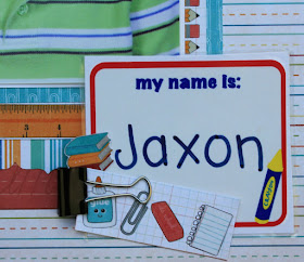
My husband and think this is just the funniest preschool picture. Our son looks utterly perplexed as to why someone would be taking his picture like this. Everything on the layout is trimmed from Geek is Chic paper or card stock stickers except for the "my name is:" piece. That was actually on his desk at school. I always think it's fun to preserve a memento or two on a layout.
Thanks for stopping by!
Sunday, August 14, 2011
Tuesday Trigger
It's been a while since I've played a long with a Moxie Fab World Tuesday Trigger. I often see the trigger and think, "Wow, that's gorgeous!", but I always seem to find myself running out of time to play along. Well, not this week! I saw this trigger and I made time to play along.
My first impulse was to create a dress card and just lift the picture as is. I'm sure it would have been cool, but I decided to try to push my creative juices a little further. Well...even though it's only August, I had this crazy idea that that pattern would make a lovely Christmas Tree.
I not only was inspired by the shape of the layers, but the mix of colors and patterns on the dress. I also loved that the whole dress seemed to be tied together into a cohesive unit by burgundy edging, so I tried to mirror that in my card as well. For my patterned paper, I used Fancy Pants' Tradition Collection. The trunk of the tree is an SRM sticker from Fancy Sticker Sentiments Christmas. I found it easiest to use a bunch of Mini Glue Dots®to adhere all my layers together. If you want to see what other people did with this cool Trigger, you can check out the Moxie Fab World Tuesday Trigger here.
Thanks for stopping by!
Friday, August 12, 2011
Let's Celebrate
I made this card for a dear friend of mine. I don't know if they've told the whole world they're expecting yet...so shhhhh. This will be baby #2 for them, and I'm just so excited for them to be adding to their family. I thought I'd send her a little note saying just that. Here's the card:
Lawn Fawn's Plus One is pretty much the perfect stamp set for all things baby. I paired it with some paper and trims from Crate Paper's Neighborhood collection. The grey pleated ribbon (which I have fallen in love with) is from May Arts. Now, I'm off to work on some layouts with some brand new papers I just picked up! Woo-hoo!!!
Thanks for stopping by!
Thursday, August 11, 2011
Sometimes I Squeal Out Loud...
...there, I admitted it. Case in point, Tuesday Kim Hughes (you know THE Kim Hughes of Paper Smooches) e-mailed me to ask if she could put my "thank you berry much" card (using Paper Smooches Digi Stamps) on the Paper Smooches blog today. I squealed a little out loud, then I e-mailed her back a very enthusiastic yes. You can check that post out here. My card is there, but so are a lot of other really sitinkin' cute cards that you won't want to miss. So, while I'm on a Paper Smooches high, I thought I'd make a few more Paper Smooches cards.
...and just in case that isn't enough Paper Smooches for you, I'm also blogging over at A Walk Down Memory Lane today and there's another fun card using the Fruitastic set over there (and a tip on customizing embellishments).
Supplies:
You are a Peach
Paper: Jillilbean Soup Watermelon Gazpacho Soup (Ice Cubes, Sprig of Mint, Yellow Bell Pepper, Orange Juice)
Stamps: Paper Smooches Fruitastic, Paper Smooches Friendly Flowers
Accessories: Jillibean Soup Watermelon Gazpacho Soup Cardstock Stickers
Totally Sweet
Paper: My Mind's Eye Lime Twist Life of the Party
Stamps: Paper Smooches Fruitastic, Paper Smooches Friendly Flowers
Accessories: Copic Markers, Ric Rac, Crate Paper Neighborhood Trims
Tuesday, August 9, 2011
Bun in the Oven
It seems like life events go in waves. Right now I know quite a few pregnant people, so I decided it was time to add to my "congrats on your pregnancy" cards. Plus, it was a really good excuse to go out an buy Lawn Fawn's Plus One stamp set.
I used some leftover bits from Simple Stories 100 Days of Summer. It was kind of fun to do a baby card that wasn't all pastels. I've got a few more baby cards that I'll try to space out on here over the next few days.
Thanks for stopping by!
Sunday, August 7, 2011
Scrap Room Decor
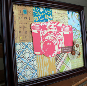
Sometimes I get an idea in my head and I just have to put down whatever I'm working on to make what's in my head. This time I had an idea for a piece to put on my craft room wall.
The frame is for an 8" x 10" photo. I used Authentique's Splendid Collection to create the background. These are actually leftover pieces I had from making some Authentique layouts a week ago. I stitched the pieces together with my We R Memory Keepers Sew Easy tool. The camera is a Print & Cut file from Silhouette. I sponged a little Tim Holtz Brushed Corduroy Distress Ink onto the edges of the camera to give it a more weathered feel. I attached the camera with foam dimensional adhesive to add some depth to the picture. The canvas flower is from Maya Road. I created the lace flower from some vintage lace I happened to have lying around. The paper flower was made with about a 1/2" x 8" strip of paper. I printed the saying, "Every picture has a story to tell." and added it to the picture.
Now all I need to do is get my husband to hang it!
Supplies:
Paper: Authentique Splendid (Richness, Renown, Brilliance, Magnificence)
Accessories: Maya Road Canvas Flower
Tools: Silhouette SD, We R Memory Keepers Sew Easy, Tim Holtz Distress Ink (brushed corduroy),
Friday, August 5, 2011
Paper Smooches
First up, I have to say, "Wow! It's Friday and I haven't posted anything since Monday." Sorry. I'm already working on a post for tomorrow of a mini album I just finished, so I won't neglect things here so long again.
Second (and this is far more interesting news), I worked at A Walk Down Memory Lane Wednesday night and was thrilled to find out they now have Paper Smooches stamps at the store! I don't think they're at the on-line store yet, but if you shop at the Brick & Mortar store you can get them. I'm having a hard time deciding which set to buy first!
Third, Paper Smooches posts a free digi stamp on-line every month. I'm not super big on using digi stamps (there's just something about getting your fingers inky), but Kim Hughes' Paper Smooches Digi Stamps are too cute to pass up. Plus, did I mention they're free! Here's what I did with this month's free digi:
The image could really be a few different things (grapes, raspberries, blackberries), but since I have this growing in my back yard
I was thinking raspberries. I used twine from The Twinery to fill in the berries. I used a Copic marker to color in the leaves and stem. Since I really wanted the berry to be the focal point I kept the rest of the card quite basic with a kraft on kraft color scheme. I inked the top layer of kraft card stock with white ink and used foam dimensional adhesive to attach it to the bottom layer. The finished card size is 4" x 4".
Thanks for stopping by!
All Together
My husband's sister and her family live in Florida, so it's only about once a year that everyone on my husbands side of the family is all together at once (there are 4 kids total in my husband's family, all are married, 3 of us have kids and the 4th has their first on the way). Since we were all together, you can't blame my Mother-in-law for wanting to take some family photos. I thought it would be fun to put all of the photos into a little mini album. The album is from Cosmo Cricut, and all of the paper, trims, stickers, chip pieces, etc. are from Crate Paper's Neighborhood collection.
Thanks for stopping by!
Monday, August 1, 2011
What I Worked on This Weekend
Lately it feels like every Friday I start a project with plans to have that project and 2 or 3 more done by the end of the weekend. However, when Monday rolls around, I'm still working on that first project. Case in point, this layout:
I started it Friday and was going to have it and 2 cards done by the end of Sunday, however today I found myself finishing the layout. And the 2 cards? I still need to start those. Oh well, summer weekends are for making memories like the ones above. I can always get my "work" done later.
I grabbed Happy Camper from Imaginisce especially for these photos. I knew with those great chipboard stickers, it would be perfect. If you spend a lot of time in the great outdoors over the summer, you'll want to check this line out. It's full of trees, canoes, campfires, marshmallows, and woodland creatures. Here's hoping I get a little more done this week than I did over the weekend!